Visualizing the results
There are multiple ways to visualize the results we retrieved from the data. One way is just to plot multiple sample paths as you already saw just after the MCMC sampling. Another way is to calcurate and present the Highest Density Intervals (HDI) to quantify the posterior probability distribution, which is demonstrated in this notebook.
Let’s import some helper functions in FRAP.
[1]:
from frap import visualizer
We first perform the Kernel Density Estimation at each radius using the MCMC sampling results. Here, nskip is a number to thin-out the sample just to reduce the calcuration cost.
[2]:
kde_results = visualizer.calc_kde( 'mcmc_reuslts.pkl', nskip=100 )
Starting KDE calculation...
Processing key: log10_Sigma_d
Processing key: log10_a_max
Once you have the results, you can calcurate the HDI with a specific source distance (for conversion of the radial unit).
[3]:
hdi_data = visualizer.calc_hdi(kde_results, D=114.9)
Then we can make a plot like this.
[4]:
axes = visualizer.plot_kde(hdi_data)
<Figure size 640x480 with 0 Axes>
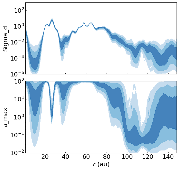
The colors correspond to the 68.3, 95.4, and 99.7% (1, 2, and 3\(\sigma\)) HDIs. You can directly access to this by e.g.,hdi_data['log10_Sigma_d']['hdi_map'] that have integer values of 0,1,2, and 3 for >=3, 3, 2, and <=1 \(\sigma\) regions, respectively. Here, hdi_data['log10_Sigma_d']['X_fine'] and [Y_fine] have the grid values. It is also possible to directly edit the plot using the returned variable (axes).